31
Dec, 13DBTP 101 Understanding our Logo
DBTP Classic Logo
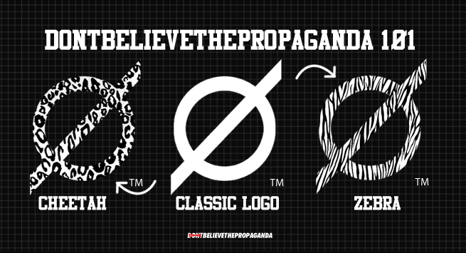
It’s a circle with a line through it. Kind of like the “do not” symbol, only its line goes outside of the circle. The line reaches out side the circle to symbolize the power we have within ourselves to accomplish goals and pursue our dreams. Seize each opportunity and make the best of every moment. The symbol should not be confused with saying “NO” hence the name DontBelieveThePropaganda!
It’s color is purple for royalty. It’s skin can change color or pattern to match the dynamics of its environment. The logo has endless possibilities, but just wait till you see what the other two logos can do.
DBTP Skinny Logo
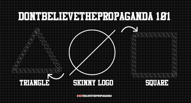
Now, don’t judge this logo by its appearance. Though small in weight, it’s dynamics make for a unique set of skills and talent. The skinny logo is able to manipulate itself by number and size. It really holds its own weight even being a skinny minnie.
DBTP Fat Logo
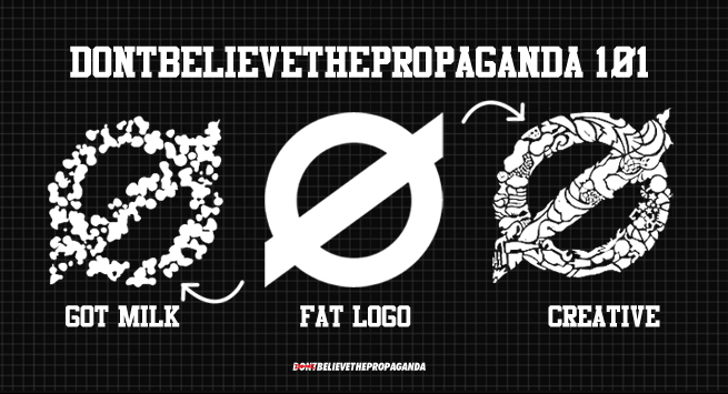
The fat logo is probably the most used out of the three logos. It’s the most resourceful of the logo forms. The fat logo changes appearance by using common objects and elements. Its abilities and forms are endless and this logo has many designs up it’s sleeve, just waiting for the right opportunity to display its power.
No comments yet.